Friday, June 10, 2011

Final Essay

The Pose

When it came to posing the character I tried to choose a pose that was relevant to my character. Considering that my character is a teenage girl I thought it would be appropriate to pose her singing into her hairbrush. In order to achieve this I referenced the imagery for many of the singing games, such as sing star and band hero. While searching for my referencing I came across an advert for band hero which featured Taylor Swift. The advert suggested that through playing band hero one could feel famous like Taylor Swift, who is a teenage pop star, in the comfort of ones own home. This reinforced that I was on the right track with my pose as my character would fit into the market segment which this advert appeals to.

(Paul Clark)

In line with the adverts message I wanted to make my character look like a popstar singing into her hairbrush at home. Therefore I posed her so that she appeared to really be singing and that she wasn’t holding back, similar to the image of Taylor Swift above, and how her head is swung back as she belts into the microphone. However I prefer the weight distribution in the pose when her arm is placed on her hip as opposed to hanging at her side. Therefore she is singingas though she believes that she is Taylor Swift.


Camera Angle


Considering that the pose was set up to make her look like she thought she is a pop-star I decided to place the camera at a low angle as this will giver her a look of power and reittorate how she is feeling.


Additionally I set the lights up from a low angle therefore when one sees the shadows they are behind her projected on the wall, almost acting as her alter ego and enforce the power which the low angle of the camera is attempting to give her.

Composition

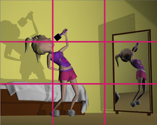
As discussed the story of the pose is that my character is singing into her hairbrush as though she believed she was a pop star. Therefore the fact that she is singing is the most important part of the pose. Thus when I was placing her within the thirds rule I decided it was most important to have her mouth on a third. As this would draw attention to exactly what it is she is doing.

I couldn’t get the floor line to coincide with the bottom third line I positioned it so t

hat the bed was on that line.

The mirror I placed in the right hand third block to balance out the image so that all the objects weren’t cluttered together on the left.

Design Elements

Space

A very important design element for this particular pose is space. This pose is a pose in movement and she will very soon be moving out of this pose into another one as she performs for herself. Therefore there needed to be space for her to move. There is enough space around her for her to have swung her arm up into such a high position without hitting the mirror.

Additionally the floor area in front of her indicates that there is space for her to move around if she wished to.

Colour

In my final render she is wearing a pink top, pink slippers, the

wall is pink and the bottom of the bed is mainly pink. Therefore the contrast of the purple shorts and the white duvet draw ones eye to where the girl is standing as opposed to the mirror where she is reflected.

Although the purple of the shorts is present in the mirror there is no major white are reflected by the duvet therefore where she is standing has the most alternate colour present.


Texture

I gave the Clothing a very subtle Texture which isn’t exactly visible from the distance we are looking at her from, however it does make it look more interesting that just a smooth phong. Additionally I added textures to the carpet and to the walls which are noticeable and make the image look more believable.

Aditionally the various textures make the image more interesting than if I had used just one texture (such as a lambert) throughout.


Conclusion


Therefore the pose which suggests that she is a girl who believes she is a pop star is reinforced by the camera angle which suggests her feeling of power and it is further enforced by the composition which draws ones eye directly to what she us doing. Additionally the design elements ensure that the over al image is interesting and believable as it gives her space to move in, contrasting colours to draw ones eye towards her and contrasting textures which add more interest to the image.


All in all she is the focus of the composition however it is what she is doing which I have payed the most attention to when setting out.


Movie Example

(Steph Sharples)

This Image is taken from the movie Black swan. It is from a scene in the movie where Nina Sayers (Natalie Portman), has a hallucination and has a fight with herself, the black swan versus the white swan or her good self versus her bad self.

This shot is taken from a high angle which belittles Nina as she struggles to fight with herself. It emphasizes the fact that she is helpless. As previously mentioned the fight takes place between the ‘black swan’ and the ‘white swan’ therefore the room is also split into black and white, on the right hand side is Nina’s beautiful white dressing table (Nina was told that she was too good to play the black swan in Swan Lake). And on the left hand side is a dark dingy looking chair, which would represent the black swan and dark side of Nina. However the fight is taking place almost directly in the middle of the room, emphasizing how she is caught between her innocent side and her dark side.

Therefore although the fight would clearly suggest what is happening in the scene the mood of the room, with dark dingy side versus the beautiful light side, helps the viewer feel the mood of the fight more clearlt. It ultimately just emphasizes and helps tell the story better.

Cited Works

Paul Clark. Taylor Swift sings "Love Story" in Band Hero TV Spot. Just So You Know. Cambio 2009. Website. 10/06/2011

Steph Sharpless. Trailer for Darren Aronofsky's Black Swan - with HD Stills. Crazy Critics. Website. 10/06/2011

Sunday, May 15, 2011

Face Shape Research Essay

When animating a 3D character it is important to set up certain facial expressions for the character prior to animating it as it will not only make things slightly easier, but also ensure that the character is portrayed 'in character' through out the movie.

Although one shows a vast amount of emotion in ones face, one must not under estimate the power of body language. Therefore when one creates expressions for ones character it is important to consider the fact that the character is going to be positioned in numerous poses. Additionally when animating the character it is important to use the facial expressions and body language together and not allow one to oppose the other.

Expression Analysis:

The Character Who I have chosen to analyze is Rapunzel from Tangled. Considering that Rapunzel has been locked up in a tower for most of her life she is often amazed at all the new things she encounters in the world around her. The animators have managed to show her awe and amazement in combination with many other facial expressions, which really brings out the character and personality of Rapunzel.


Expression 1:


(Rajan)

In this first facial expression Rapunzel is gazing at the dress she made for Pascal. This is not something which she finds too exciting so her smile is not a full one as she is smiling slightly with a closed smile and her eyes don't show too much emotion. Her eyes appear to be gazing past Pascal, not exactly at him. This gives the viewer the sense that she is not quite satisfied and is longing for something more.

Furthermore she is leaning to the one side, this indicates that she is not alert to what she is looking at but she is quite comfortable and accustom to it. Additionally her smile is stronger on the left hand side of her face and weaker on the right hand side of her face, the side which she is leaning towards. This emphasises the fact that she is not that interested in what she is looking at.
However at this point in the movie she has not yet voiced her dream to go and see the lights, it is for this reason that she is still smiling at Pascal and she doesn't look completely bored as the viewer and Rapunzel have not actually realized her desire to leave the tower.

However on an aesthetic level the unequal smile makes her face more dynamic and makes the expression more interesting. Therefore even though she is pulling a slightly bored expression it is not boring for the viewer and therefore manages to keep our attention so that we will see and consider how she is feeling.


Expression 2:


(Cap 'n Carrot)

This Image comes from the scene where Flyn Ryder has come into Rapunzel's tower and she has him tied to a chair with her hair. This is an interesting Facial Expression because it is Rapunzel's first encounter with something from the outside world.

This expression is distictaly more alert than the previous one, seen by her wide open eyes and her more erect head. Her huge eyes show her amazement at what she is seeing, she is taking it all in and looking at every aspect of Flyn. However her closed mouth, which is almost pouting, expresses her fear and uncertanty. Because her mouth is closed it acts as a barrier between her and Flyn, this barrier is emphasized by how tightly closed her mouth is.

Her uncertanty is highlighted even further by her slightly skew head which shows that she is not completely confident about what she is looking at. Another indication of her uncertanty is the way her head is pulled back defensively into her shoulders, her one shoulder is even in front of her head protectively.

Expression 3:


(Prison Break Freak Dot Com)

This image is from the same seen as the one above however the emotion portrayed is quite different. She is excited as she has just negotiated with Flyn that he will take her to see the lights.

Her eyes are still open in amazement, however her mouth is smilling a wide open smile. It is no longer acting as a barrier between her and Flyn. Her whole face is open and excited. Additionally her head is even more straight as she is certain about what she wants, which is to see the lights. Furthermore her head is pushed forward away from her body, in contrast to the way it was pulled back to ward her chest in the previous expression. Her shoulders are square as she is more open to what she is seeing.

However as Rapunzel has always been taught, by her mother, to be afraid of the outside world she is still protecting her self from it with the pan which shields her body from Flyn's.


Conclusion

The three examples shown above indicate the way one can keep a character 'in character' while still portraying different emotions. In examples 2 and 3 Rapunzel is shown both inquisitive and excited however she is portrayed protecting herself from the outside world, something she has been taught to fear. The self protection is shown manly through her body language which demonstrates the importance of it and the way one can combine both facial expressions and body language to portray interesting emotions.

Text sited

Cap 'n Carrot. "Tangled". This is Dad's big Plan. Wordpress. Web. 15 May 2011

Prison Break Freak Dot Com. "Tangled". Prison Break Freak Dot Com. Beany Host. Web. 15 May 2011

Rajan. "Tangled". www.rajan-animationinfo.blogspot.com. Blogspot. Web. 15 May 2011

Monday, May 9, 2011

Character Modeling Research ssay

When modelling a character it is important to take into account the way in which the body and face deforms with movement. A sound model will allow the character to deform in the most natural way. A way to ensure that the model will deform correctly is to follow certain edge loop structure. While every model is different there are some basic guidelines which one should follow. One should take particular care when modelling the face, shoulders, knees and elbows. As these are body parts which perform a lot of movement.

Face

Good facial modelling “means knowing about the relationship between features on the face, what the changes in those relationships will do to the expression, and how to be in control of all that with the simple tilt of the head or the addition of a crease” (Osipa, J). Therefore “good point layout isn’t simply modelling cleanly, with evenly spaced edges and quads; it is to model for movement” (Osipa, J). Bellow is an image from Jason Osipa’s book Stop Staring which demonstrates the effect good edgeflow can have on the movement of a model versus the effect bad edge flow can have on the movement of the model.

Jason goes on to explain that it is important to facilitate good movement from one face shape to another. All facial shapes will be modeled out of one basic shape and while each shape is important on its own, the motion it defines between facial shapes is equally important. “This is why good edge flow in the layout is not just technically important, it’s also artistically quite helpful” (Osipa, Jason).

Bellow is an image which illustrates the shape of the edgeloops which one needs for a face.

(Werner Ziemerink)

One will notice there are circular edge loops around the lips and nose. These edge loops will define the smile liness. The “creasing which happens here is probably the most pronounced on the entire face” therefore it is important that the edgeflow allows it to happen in the correct places and shape.

As seen above the eye area also follows a circular edgeflow however one needs to make sure that there is an “almost ‘gridlike’ area off th side that leads away from the eye towards the ear” (Osipa, J). This will help one get a natural compression around the outside of the eye.

Finaly the nose area, which acording to Jason Osipa is an area which is often approached in numerous manners that he believes each have there pro’s and con’s. However there is one edgeflow which he says is important it “is simply that the top-of-the-nostril feeds into the nasolabialfold and that whatever is happening underneath the nose allows for a lot of compression and expanssion of the lips later”.

The Shoulders

While the facial area is one where a lot of motion occurs there are other areas of the body which are equally as important, namely the shoulder. One needs to ensure there is good modelling and edge loop construction in the shoulder as to allow for realistic movement. According to Werner a common error which people make is to pull the arm directly out of the characters body without establishing a shoulder. Bellow is an example of an alternative way of modeling the arm and shoulder to ensure that one establishes a proper shoulder area.

Although this is not the only way to model a shoulder it is a good one as it creates an edgeloop which runs straight from the chest and around the arm. This allow for a more natural bend of the arm against the body.

An alternative way to do the edge flow around the should, as suggested by Werner, is to create the edge flow as seen bellow.This method is an alternative one which also works well as it acknowledges the shoulder area and therefore allows for natural deformation of it.

Conclusion

Ultimately it becomes appaarent that edge loops are not used purely because they help create an appealing mesh, but are rather used to assist in the deformation of the character. While the face and shoulders are not the only areas of the body which need edge loops they are two important ones. However by understanding edgeloops one can apply them to other areas of the body which will need to deform. The important thing to think about when building a model is how each areas is going to move and what will allow for the best deformation of the area.

Cited Work:

Osipa, Jason. Stop Staring: Facial Modelling and Animatino done Right, third edition. Canada: Wiley Publishing. Inc. 2010. Print

Ziemerink, Werner. Master Classes Luma. Lecture

Sunday, April 10, 2011

Customising Workspace Research essay

Customizing your Scene


This research essay looks at the importance of customizing your scene before one starts producing an animated film.


According to i3d tutorials custom toolbars help one “facilitate [ones] work and help [one] work a lot faster and more efficiently… it can help [one] speed up [ones] workflow”. This applies not only to toolbars but also to customizing ones scene in general. If one has a scene customized in a way which best suits the use of the scene it will speed up the workflow.


The default set up for Softimage is shown bellow:


However this set up may not be ideal for use in all scenes and it may be beneficial to customize it.


The advantages of customizing the scene:


1. It makes it more efficient as one does not have to keep changing between unnecessary windows.


2. Especially when working on a single monitor it helps to make your scene more organized and less cluttered.


3. If the windows you need are floating windows they often obscure your vision and hide some of your work. Therefore if they are placed inside a window it means one doesn’t have to keep moving them around which saves time and makes it much easier to work effectively.


When setting up your scene it is important to think about what you are setting the scene up for, for example are you going to be predominantly animating, modeling or lighting the scene. Once this is established one can start making the necessary changes.


One of the obvious changes one can make is to change what will be displayed in the four separate divisions. If one is modeling, for example, then it may be useful to be able to see each side of your object in these windows. However if one is animation one may want to have the camera view, the user view and the graph editor displayed in the windows. If the graph editor is easily accessible and readably available it will make ones work flow much more efficient. Additionally if one can see the camera view and the user view one will be able to see how the scene will look to the viewer, whilst simultaneously editing it in the user view. Thus one will get a better idea of how the animation is looking as a whole.


Bellow is an example of how the scene is set up when using face robot. Although I may never choose to use face robot itself I think the set up is one which will be very useful when lip sinking as one can see the sound waves and the animation simultaneously. This will make working with sound much easier and clearer.

(Renderosity)


I selected this example as sound plays an important role in animations, whether it is lip sinking or sound effects. Therefore when I work on my future animations I can use this set up to ensure I sink the sound properly to the animation as I will be able to see both the animation and the prominent beats at the same time.


Tool Bars


The advantages of customizing tool bars:


1. If there are certain commands which one has to use over and over again it will make ones work flow much quicker as it will be one click away as opposed to maybe three or four.


2. The long lists of commands displayed in most menus means it may take quite long to find the command which one is looking for. However if the command is placed in a customized tool bar it will be much quicker as one won’t have to look through long lists of options and wait time trying to find what one is looking for.


3. When animating a custom toolbar is especially beneficial as it would be very time consuming to have to select each control one needs every time one wants to key frame it. However through creating a custom tool bar where one sets a button to select the specific controllers needed, it will make it much easier as one only has to press one button as opposed to selecting numerous objects.


Once again depending on what the purpose of the scene is for one can set up customized tool bars. As previously mentioned when animating it may is very helpful to create buttons which will quickly select a certain animation controls at once. This will save time as it will ensure that one does not have to keep selecting multiple controls but can rather just click one button. Alternatively when modeling one may want to create a custom toolbar with the menu options one uses the most frequently, such as the split edge tool. This will save time as it will be one easy click away.


Bellow Is an example of a toolbar set up for animation purposes. I chose this example as they have separated the buttons in the toolbar by subheadings. This will make the toolbar more user-friendly especially when someone as to work on a scene customized by me, as they will have a better understanding of the toolbars. Furthermore it will be useful for me if I ever have to go back to a project as I will understand more clearly and quickly what I intended the tool bar to be used for. This will ultimately benefit my over all work flow as it will make my workflow quicker when I am working on the project or it will make it quicker for me to got back to and understand a project, especially if I have used icons and not words for my buttons.


Furthermore if one has multiple buttons on a custom tool bar it could be counter effective as one has to search through the many options in the toolbar every time to find what one is looking for. However if one creates subheading it will make it much easier to quickly find what is needed as it will separate the options in a logical manor while still keeping the buttons one easy click away.


(Softimage Resources)


Ultimately customizing ones scene is of huge advantage as it assist one in completing the project with more efficiency and with a better workflow. However to ensure that one gets the most out of the customization it is important to be aware of what and why one is customizing the scene. Additionally when adding toolbars it is important to make sure the toolbars are created in an orderly and easy to understand way otherwise it will become to complicated and reduce effectiveness of the toolbar.

Works Cited

I3d tutorials. Softimage/xsi custom toolbars and shelves. YouTube. 2007. Web. 10 April 2011

Rederosity. Automated Lip Sync in Face Robot and Innovative Rigs with Interactive Creative Environment (ICE) Kinematics Set New Bar for Character Animation. 2010. Autodesk, Inc. Web. 10 April 2011.

Softimage Resources. Rog – Flac. Web. 10 April 2011

Sunday, April 3, 2011

Rigging Essay

Rigging Essay

Default Rig

Softimage has two default rigs, one for human characters and one for animal (or fantasy) characters. The rig for the human character has a head and neck, two arms and hands, a spine, a pelvis and two legs and feet. The rig is accompanied by numerous controllers and constraints, which assist in the animation of the character.

Character rigging in Softimage has been made very user friendly as one can easily modify the default rig as needed. The modifications to the rig can be done in one of two ways. Either one can create the basic biped rig and physically lengthen and adjust the bones as needed. Alternatively one can load a rig-building guide, this guide allows one to set up the “size and proportions to match your character, then create a rig for your character based on this guide” (Softimage Users guide). When using the biped guide one is able to, not only define the skeleton structure, but one can also set the volume control. The volume controls are “displayed as yellow splines with small manipulator cubes, which you can use to define the body’s volume” as seen below (Softimage users guide).

When using the default rig in Softimage the rig comes with constraints and controllers. This makes he rigging process much easier as one does not need to set up all the controllers but can rather add where necessary. Additionally one can add any desired bones to the rig that aren’t already there.

Once the rig fits the character as desired the rig must be attached to the character, this is done by enveloping the rig to the character. One will then need to paint weights on the character to ensure that the ‘skin’ of the character is attached in the desired way to the rig. However if one had attached volume controls to the rig it “can allow a character to reach extreme poses more easily than by weighting alone” (Softimage users guide).

It is evident that the default rig provides a wide range of options for modification. This allows the rig to be quite versatile and gives it the ability to be applied to numerous character designs.

Manually set up rigs

The rig I am going to discuss is not one I found on the internet but rather one which I made following the Softimage XSI tutorials.

The process of creating a rig manual starts with creating the bones to fit the character. It is important to make sure that one is in the correct view when creating the bones, as this will determine the direction in which the bones will bend. The structure of the bones was very similar to those in the default rig as I had a head and neck, two arms and hands, a spine, a pelvis, two legs and feet. The construction and number of bones used were very similar to those in the default rig. Therefore the skeleton of the manually made rig is basically the same as the default one.

Once the bones were in place one has to manually assign the controllers and constrains. This is important in ensuring that the rig can be animated effectively. One can add the controllers as desired but the main places would be feet, hands, pelvis neck and head. Once again the places where the tutorial suggested that the controllers were placed was in the same positions as those in the default rig. Finally, like when using the default rig, I needed to envelope the rig and paint on the weights.

Therefore the process of creating a manual rig was far more laborious than using the default rig, yet in both cases one arrives at the same destination. One could argue that through creating ones own rig it allows for more versatility that the default rig does. But, as previously discussed, the default rig allows one to modify it so vastly that there is no need to create a rig for that purpose. Additionally once the default rig is in place one still has the ability to add in bones, constraints and controllers where necessary.

Ultimately, the most important aspect of rigging is not manually creating a rig, but rather being conscientious when modifying the rig to fit the character. The better the rig fits the character the better the rig will be enveloped to the character. As discusses previously the volume control which one can apply to the default rig assists with this. If the volume of the character is suggested correctly, the more successful the enveloping will be.

Works Cited

Softimage. Softimage Users Guide. Autodesk, 2011. Software

Tuesday, March 22, 2011

Motivation for Lighting

Lighting 1

In the first of my light rigs I was trying to light a metal dish to get the full effects of the metal. At the same time I wanted the dish to stand out from the background.


Lighting the metal was more difficult than I thought it would be. I looked at metal objects and noticed that they contained bothers very dark colours, almost black, and very light colours, almost white. Therefore I added a backlight to try and bring out some of the whiter colours around the edges of the bowl. My Key light I placed on the upper left side of the bowl so that it would cast light on the area of the dish, which was furthest back. This would bring the dish forward out of the dark light behind it. The Fill light I placed to the left of the camera, slightly lower down than the Key Light. This was once again an attempt to catch sections of light on the bowl to create the light and dark contrast. Another way I tried to get a contrast into the bow was through placing the shadow umbra value down to 0 on certain lights light.


In order to get the dish to stand out from the background I isolated the lights, which would hit both the dish and the wall so that they only hit the dish. Therefore I could place a bright lighting onto the dish without worrying about it lighting the wall. I then added a light, which only lit up the wall and took the intensity down to 0.2 so that it just allowed one to see the texture without it detracting from the dish.


Lighting 2


For my second lighting rig I tried to create an evening scene where the light was cast by a lamp, which had been cut out of the image. But the lamp would be positioned to the left of the chair.

I looked at household lamps and noticed that most of them let off a yellow tinted light. For this reason most of the lighting in the scene has been given a yellow tint. The predominant light source was coming from the left hand side (where the lamp would be). Therefore the Key was placed at the left the camera. The backlight was placed at the top left behind the chair and was given a strong orange tint, to mimic the light colour of a lamp.


Additionally I needed to light the window so that it didn’t look pitch black and portrayed its reflective qualities. Therefore I aimed a light specifically at the window, which I tinted a dark blue to try and lighten the over all look of the window.


The right hand side of the chair was deliberately left very dark, as there is no light source lighting it.


Lighting 3


In the final Lighting Rig I did I wanted to create a late afternoon look with the sun coming through the windows. I noticed that afternoon sun was very warm in colour and the shadows were relatively harsh but not as harsh as those cast by midday sun.


My Key Light came from the left of the chair as though it was coming through the left window. The Fill Light lit up the chair from the front as well as the wall behind it, which would otherwise have been in complete shadow. I gave the Fill light a very slight yellowy orang tint to create the warm feeling of afternoon sun. And my backlight was tinted quite orange to allow the chair to glow slightly from the right. As the light was streaming into the room from the left to the right I had to additionally light the back wall to look as though light was coming through the window onto it. Therefore I placed a light outside the window, which cast the shadows of the window frame onto the wall. This light also had an orange tint added to it.

Monday, March 21, 2011

Lighting Research Essay

Three-point lighting

Three-point lighting is the customary lighting technique used in most visual media. It consists of three lights “called the key light, the fill light and the back light” (mediacollege.com).

The key light “represents the most dominant light source, such as the sun, a window, or ceiling light – although the Key does not have to be positioned exactly at this source” (3D Render.com). Therefore the key light will create “the subjects main illumination, and defines the most visible lights and shadows… and creates the darkest shadows” (3D render.com).

Jeremy Birn suggests that one uses a spot light for the key light and that you offset the Key Light 15 to 45 degrees to the side of your camera, from the top view. From a side view, he says, that you should raise the Key Light above the camera also 15 to 45 degrees (3D Render.com).

The purpose of the Fill light is to soften and extend “the illumination provided by the key light, and makes more of the subject visible” (3D render.com). While the key light creates the most dominant light source the Fill light will create any secondary light source such as “the sky (other than the sun)… table lamps or reflected and bounced light in your scene” (3D render.com). According to Birn the best choice of light for a Fill light is a spot light however one could use a point light (3D render.com).

In terms of the placement of the Fill Light, one should place it on the opposite side to the Key Light, however one should not place them exactly symmetrical to each other (3D render.com).


Because the Key Light is the predominant light in the setup the “Fill Lights can be about half as bright as your Key (a Key-to-Fill ratio of 2:1), [however if one wanted to create] a more shadowy environment, use only 1/8th of the Key’s brightness (a Key-to Fill ratio of 8:1) (3D render.com).

However when it comes to creating shadows from a Fill light they are optional and predominantly not used. Yet to “simulate reflected light, tint the fill colour to match the colours from the environment. Fill lights aare sometimes set to diffuse-only (set not to cast specular highlights)” (3D Render.com).

Finally there is the Back Light, which is also known as the Rim Light, “creates a bright line around the edge of an object, to help visually separate the object from the background” (3D render.com).

When placing the Back Light, from the top view, “position it behind your subject, opposite from the camera. From the right view, position [it] above your subject” (3D Render.com).

How bright one decides to make a Back Light is dependant on how strong one wants the highlight on an object. Usually a Back Light will cast shadows. A Back Light will often be linked to the object which one is lighting so that it seperates it from the background (3D rendering.com).

This lighting rig is the most commonly used one as it can be used to light almost any scene or object. Furthermore due to the use of the three light all placed at different angles one has absolute control of how the light will look from each angel.

Creating Reflective Studio Light Set up (Taken from Digital Tutors tutorial on “Creating a Studio Light Setup in Softimage)

This Light set up is made up of 2 lights, a Key and a Fill Light. Additionally there are 3 reflectors, one of which acts as a skydome for added indirect illumination.

Initially one will create the Key light, for this light setup a Box Light is the best choice. As a Box Light allows one to create soft shadows. In order to create the desired soft shadows set the umbra value to 0 and then adjust the Area Transformation scaling to 30, for both the x and the Y values. It is through increasing this scaling that one can create softer shadows. For this particular light set up the Key light will be placed behind the object. As this light is our main light source the light intensity can be set to 0.75.

Next one will create the Fill Light, which will have the same settings as the Key Light in terms of the umbra and Area Transformation scaling. However as the Fill Light is a secondary light source the light intensity will be set to 0.5. The Fill light will be placed in front of the object.

Although there are two light sources in the scene, which are responsible for creating shadows, there is no evidence of direct light sources, which are creating reflections. This can be achieved through creating reflectors/diffusers.

To create the reflectors simply draw it using the ‘Draw Cubic by CV tool’. Duplicate the curve, move the duplicate along and create a loft surface mesh. It may be necessary to raise the U subdivisions as to create a smoother surface. The best material to mimic the effect of a light-emitting surface is a constant. Therefore one will apply this material to the object and set the colour to white.

Depending on the object, which you are lighting, and how you would like the reflections to be positioned, one can move the reflector around until it looks right. Additionally a secondary reflective source may be necessary to achieve the required results. In order to adjust the brightness of the diffuser one must change the HSV V component to a higher value, in this case to 3.

At this point the object possesses both shadows and reflections. However the over all lighting of the object is still quite dark. As seen, in the screen shot, bellow.


This can be overcome by adding some secondary illumination. In order to do this one must initially enabling final gather. While this will lighten the object significantly it lights it in an overall manner. Therefore if one creates a dome around all of the objects and applies a graded constant material, which grades from white to black, the secondary illumination to reflect mainly from the bottom part of the dome therefore only effecting the bottom section of the object and leave the top of the object to be light by the two diffuses and light previously set up in the scene.

Works Cited

3d Render.com. Three-Point Lighting for 3D Renderings. Jeremy Birm. Web. 17 March 2011

Digital Tutors. Creating a Studio Light Set Up in Softimage. PL Studios. 2009. 21 March 2011.

Media College.com. The Standard 3-Point Lighting Technique. Np. Web. 17 March 2011

Sunday, March 13, 2011

Motivation for textured Room

My intention when texturing this room was not to make it look overly realistic. Yet I wanted to make sure that it still looked very believable. Due to the design of the objects in the room, which are very realistic, the room already inhabited the element of believability however my attempt to not make it look too realistic proved to be quite difficult.

Therefore my main challenge when decorating the room was, ultimately, to downplay the realism. I attempted to do this through caricaturing the textures. My idea for caricaturing the textures came from the book The Art Of Up where they explain how they played around with the texture sizes when making UP, however, they state that, “there is a point where the fabric textures, if you blow them up too far, start to look like a potato sack, like a burlap (20). Therefore I knew I had some constraints to be aware of when attempting to do this.

Additionally, I found when texturing the room there had to be a balance between exaggerated textures and more realistic textures to create a believable look. Furthermore I had to use real textures and not just phongs to create the exaggerated look.

Therefore the most prominent texture that I have blown up is the one that I used for the brick walls. I found that it was important that this particular texture was caricatured, as it encloses the room and one would relate most things in the room to it. However the carpet texture I made quite realistic as I found if I made it too large it didn’t relate very well.

The next obvious texture to caricature would be the couches. Because textiles naturally vary in size it gave me a lot of room to play with, especially in terms of how big I could go. Finally the texture used for the ornaments in the room I kept quite natural and realistic as I wanted the glass to read as glass, where if I tried to caricature that too much it would not have. Additionally I left the wood quite a realistic size as, once again, I wanted it to read as wood. However to bring the element of caricaturing back to and around the these objects I enlarged the texture of the rug quite drastically.

Additionally I wanted the room to have a warm, playful and relaxed atmosphere. To achieve this I kept the walls and carpet very simple, with face-brick walls and a natural carpet colour. Which I feel managed to give the room quite an open feeling as it isn’t over imposing. Additionally it keeps it simple and doesn’t distract ones eye from the busier texture that were applied to the objects in the room.

I allowed myself to be more adventurous when it came to the couches, cushions and curtains, where I played around with colours and textures. I tried to carry the colours through the room in a playful manor by colouring the piping of the armrest in a different colour to the chair itself. But I didn’t want the room to look over claustrophobic due to too many colours and patterns, for this reason I mainly stuck to plain colours with the two patters, on the curtains and the couch, for extra effect.

Works Cited

Hauser, Tim. The Art Of Up. California: Chronical Books LLC. 2009. Book

Texturing Research Essay

According to the Softimage Users Guide a texture map consorts of “an image file or a sequence, and a set of UV coordinates. They are similar to ordinary textures, but are used to control operator parameters instead of surface colours”.

2D texture mapping is when “2D images [are] wrapped around an object’s surface, much like a sheet of rubber that’s wrapped around an object. To use an image texture, you start with any type of picture file (PIC, GIF, TIFF, PSD, DDS, etc.) such as a photo or a file made with a paint program” (Softimage User Guide). One uses a UV map to make sure that the image is ‘wrapped’ correctly around the object. Furthermore it is possible to alter the UVs as to make sure the texture is projected onto the object without distortion etc.


(Softimage Users Guide)


Where as 3D textures “are generated mathematically, each according to a particular algorithm.Typically, they are used for gradients, repeating patterns such as checkerboards, and fractals that mimic natural patterns such as wood, clouds, or marble…3D textures are projected “into” objects rather than onto them. This means they can be used to represent substances having internal structure, like the rings and knots of wood” (Softimage Users Guide).

There is one draw back to 3D texture mapping because “they [do] take longer to render than projected 2D textures. [However] procedural textures do give a better rendered result close up because pixels can be recomputed (rather than interpolated) at close proximity” (Softimage Users Guide).

But 3D textures have multiple benefits one of the most important is that “because 3D procedurals exist throughout 3D space, you often get good results on objects that would otherwise be hard to map. Instead of trying to wrap a 2D texture around a complicated sculpture, you can apply a 3D procedural and it appears to be perfectly mapped” (maya-doc.com).

(Softimage Users Guide)

One can apply 3D textures through “Softimage’s shader library, [which] contains both 2D and 3D procedural textures” (Softimage Users Guide).

Projecting Textures

Each texture must be associated to a texture projection. The projection controls how the texture is applied across the surface of an object” (Softimage Users Guide).

Planar texture mapping “projects a texture along an axis onto the specific plane” (Softimage User guide). There are three options for how you would like your texture projected, either along the xy axis, the xz axis or along the yz axis.

Cylindrical projection allows one to “project a texture from a virtual cylinder around an object towards the central axis of the cylinder” (Softimage User guide).

Spherical Projection “maps a texture onto an object similar to a beach ball, with some distortion at the +Y and – Y poles” (Softimage Users Guide). In other words it will pull the texture from the +Y pole to the –Y pole of an object.

UV projections, unlike the previous two mentioned, can only be applied to NURB surfaces. “UV projections follow the UV parameterization of NURBS surface objects (no relation to texture UV coordinates). A UV projection behaves like a rubber skin stretched over the object’s surface. The points of the object correspond exactly to a particular coordinate in the texture, allowing you to accurately map a texture to the object’s geometry” (Softimage User Guide).

Camera Projections: “A camera projection projects a texture from the camera onto the object’s surface, much like a slide projector does. This is useful for projecting live action backgrounds into your scene so you can model and animate your 3D elements against them. Changing the camera’s position changes the projection’s position. Once you have positioned the texture on the surface to your liking, you can freeze the projection” (Softimage Users Guide).

A Cubic Projection is “when you apply a cubic projection to an object, the object’s faces are assigned to a specific face of a cubic texture support, based either on the orientation of their polygon normals or their proximity to a face. The texture is then projected from each face of the support using a planar or spherical projection method.

Unique UVs Projection can only be applied to polygons and there are two possible ways of doing it:

1. Individual Polygon packing, which “assigns each polygon’s UV coordinates to its own distinct piece of the texture so that no one polygon’s coordinates overlap another’s.

This is useful for render mapping polygon meshes. Typically, you apply textures to an object using a projection type appropriate to its geometry. Then you can rendermap the object using a new Unique UVs projection to output a texture image that you can reapply to the object. The texture is applied to texture each polygon properly without you worrying about “unfolding” it to fit properly” (Softimage Users Guide).

However as usefull as this form of mapping my sound it has one draw back. “A polygon-packing style Unique UVs projection only produces good results if you use a texture created specifically for the projection, for example, an image created using Render Map” (Softimage Users Guide).

2. Angle Grouping is applied after you have decided on a projection direction, you can then group “together neighboring polygons whose normal directions fall within a specified angle tolerance. This process is repeated until all of the object’s polygons are in a group. The groups — or islandsare then assigned to distinct pieces of the texture so that no two islands’ coordinates overlap each other” (Softimage Users Guide).

Contour Stretch Uvs Projects, is another method of U mapping which can only be applied to polygons. This method allows “you to project a texture image onto a selection of an object’s polygons. Rather than projecting according to a specific form, a contour stretch projection analyzes a four-cornered selection [of nodes] to determine how best to stretch the polygons’ UV coordinates over the image.

Contour stretch projections do not have the same alignment and positioning options as other projections. Instead, you select a stretching method that is appropriate to the selection’s topology and complexity… [They are] useful for a number of different texturing tasks, particularly for applying textures to tracks and roads on irregular, terrain-like meshes” (Softimage Users Guide).

Unfold Projection “creates a UV texture projection by ‘unwrapping’ a polygon mesh object using the edges you specify as cut lines or seams. When unfolding, the cut lines are treated as if they are disconnected to create borders or separate islands in the texture projection. The result is like peeling an orange or a banana and laying the skin out flat” (Softimage Users Guide).


(Softimage Users Guide)

Works Cited

Maya-doc.com. Texture Mapping. No place of publication. No date. Web. 12 March 2011

Softimage. Softimage Users Guide. Autodesk, 2011. Software.